Look Alive! Facebook Has Made Changes That You Should Be taking Full Advantage Of!
SURPRISE! Facebook has done it again!
In a bid to keep the platform relevant and most useful for your business and for its users, Facebook have recently made changes to reflect how its users are reacting to and engaging with posts
There are a few obvious changes in the last week or two that you may have noticed and some that you might not yet be aware of. Never fear – that’s why we’re here – to keep you up to date with all the latest goings on in Social Media land.
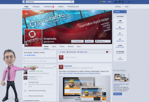
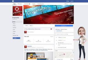
Before on the left, After on the Right
Firstly Changes to the page layout
You may have also noticed that there have been a number of changes to the profile page layout of your business pages.
- The profile picture has been moved to the left of the screen, making your cover shot bigger and more visible. Be sure to have a look at your cover shot and check that the design and layout still look right after this move. You now have more precious space to play with! Call your superlative Graphic Designer (Ahem, that would be us!) to design a cover shot for your business today!
- Your Call to Action button such as the ‘Message’ or Call Us’ or ‘Watch Video’ or ‘Shop Now’ buttons are now much bigger and are located to the bottom right of the cover shot. Make sure you are happy with that Call to Action button and that it is the most useful Call To Action for your business.
- Your page navigation is now located to the left of the cover shot, below the profile picture, meaning your like button is now more visible and less crowded than before! Score!
- Reviews, Maps, Videos and Images are now all much more visible in a completely new column to the right hand side of your timeline. Again, have a good look at this precious real estate and be sure you are making the most of it!
(PS, if you like this article…and we know you do!..please hit the share button below. Go on, share the love!)
Secondly the changes to the algorithm and what they mean for your business:
Facebook have conducted their research and found that;
Facebook users are more inclined to share text only based posts written by their friends, but not so inclined to share text only posts/updates written by business pages. If we think about that, it makes sense. Consumers are savvy and know when they are being marketed to. They will, however, react to a great image, a useful video or a handy infographic, when posted by a business.
- So what does that mean for your business?
Well, Facebook have decided to pull back from text only posts on business pages, meaning you will get less reach and therefore less traffic from text only posts.
- The Solution?
Simple, get funky with images, videos and really useful graphics and avoid text only, self-promoting posts. Try to offer something useful and engaging to your audience when posting.Facebook, however, did go on to pinpoint that switching to a more media/link-orientedstatus update will definitely make up for the loss.
- You say what now?
Well, simply put, if you are posting a status update and you wish to add a link to your post, you should now use the sharing tool directly from the website or article that you wish to share and this will get more traction in your posts than simply embedding a link/pasting a link into your post!
- What does this mean for your business?
It means get busy asking people to share your blog articles, your content and your videos directly from your website and you’ll see the benefits!
Well, that’s all folks – your handy social media update…just cause we love ya!
Don’t forget to share the love and post this article to your Facebook page using the Facebook share button directly below this article


